Distribution of Performance
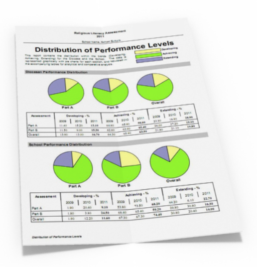
This report used pie charts and tabulated numerical data to convey the distribution of performance information. The tabulated data looked across 3 years worth of data for comparative analysis and the pie charts were grouped for the school and diocese, split across the different assessment items (Part A, Part B and Overall).
The visuals gave the reader a good overall understanding of the ratios between the different assessment items, and the tabulated data allowed analytic comparisons (especially across prior years).
Context
This was part of a larger set of reports that was developed for 40 primary and secondary schools. Nearly 200Mb of reports were created for administrators, teachers and students.